At CodeScience, we love solving the design challenges that the Salesforce platform presents…BUT, every so often we long for the freedom of designing on the open web. Don’t get me wrong, we get to make really fun sites for our marketing team like the 2018 State of the AppExchange Partners Report or the very website you’re reading this on, but let’s be honest — building an app or component with a fluid grid with logical breakpoints that looks great on any size screen is harder (impossible, even) than it sounds when working on the platform.
You Only Know What You Know
With most projects, we know a couple things after asking our clients some basic questions such as:
- Can we use out-of-box components to get to the right solution, or will they need to add some customization?
- Do we want to leverage the Lightning Design System?
- Will we use Lightning Out for teams that are still primarily using Salesforce Classic?
- Which devices are users most likely to be using and which browser will they access the app from?
All this information is great and affects a lot of our initial decisions, but there is a question that we won’t know the answer to because the platform admin will be responsible for installing the app and adding it to page layouts — where on a record page will our component be placed, in the main column or in a side column? In the past we’ve done our best to mitigate this question with varying degrees of success, usually by designing a component to be optimized for the smaller side column and crossing our fingers that no one ever places it in the wider main column.

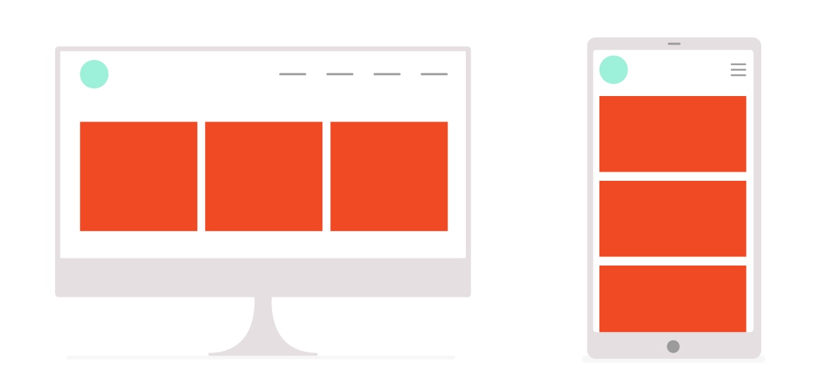
On a typical website, we can design and build responsively — meaning we can determine several break points and then target those widths by writing our CSS within a media query, controlling the experience on different size screens. But LEX isn’t quite there yet. Luckily, with the Winter ‘18 Release, we now have width-aware components! What does this mean? Components can finally behave a little more like responsive elements because we can design them to be aware of container width — a huge win for platform designers!

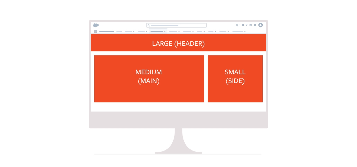
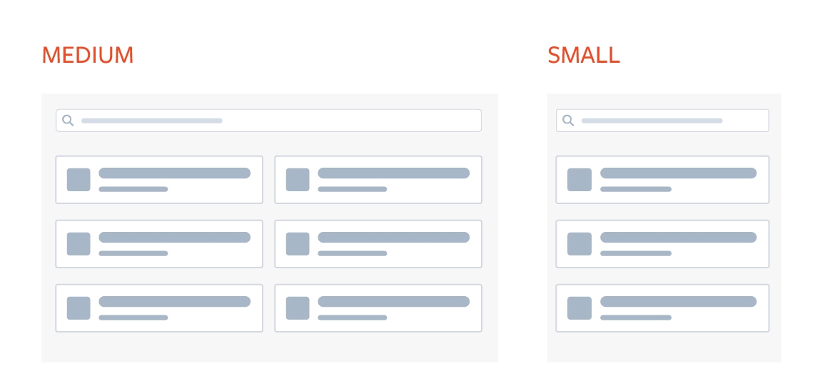
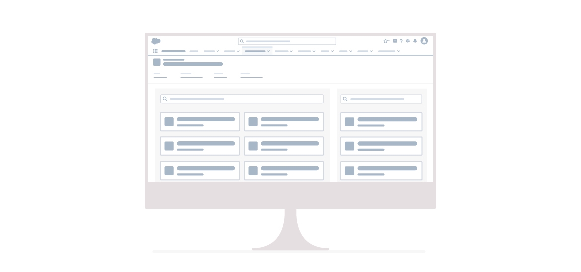
For example, let’s say we are building a contextual search component that returns results from an external system. If the component is placed in the side column, we want it to display results in a single column layout; if the component is placed in the main column, we want the results to display in a 2-column layout. Prior to this release, we would need some fancy javascript in order to make this happen. But now, by simply using the <lightning:flexipageRegionInfo /> tag and defining some classes for a small, medium or large container, we can control how components will display when they are added to different sections of a page layout.

While they are still relatively new, width-aware components are giving designers and developers a lot more flexibility when it comes to component layouts on the platform. Now, we can specify how a component should look depending on where it’s placed on a layout, which not only provides a layer of aesthetic polish, it can also improve the overall experience with the component and the platform.

Pro tip: You can place your component on a page layout in multiple places. When testing your width-aware components, place them in different size columns at the same time to see the way they react to the container.
Want to decrease churn by improving your customer’s experience with your application? Contact us to schedule a UX audit today.


